You have a website, you have an opt-in on that website, and you’re having success in trying to grow your email list. So why on earth would you need a separate landing page if you have all these three in place? Well, that’s what the experts do to supercharge their list growth and that’s what I’m going to be covering in this post. I’m going to explain to you the importance of a landing page in building your email list, and how to set up one that is going to convert really well. You’ll also find this extra useful if you haven’t yet got a website.
This is post 3 in a 5 part series on email list building. If you haven’t done so already, I’d recommend you read parts 1 and 2 to get yourself familiar:
Part 1: How to start an email list on your brand new blog
Part 2: How to easily get your blog visitors to sign up to your email list
Please note this post may contain affiliate links. Please refer to my disclosure for more information.
What’s a landing page and why does it matter?
For those unfamiliar with the term, a landing page is also known as an opt-in page or a squeeze page. The idea is to have a dedicated page with one single purpose – to get people to sign up. It’s also incredibly useful if you haven’t started your website yet. You can create a single landing page and promote it on social media so that you can start building your email list ready for when you launch your website.
The secret weapon to grow your email list rapidly – the landing page
A statistic: my landing pages consistently convert at around 60%. So that means, for every 100 visitors I get to these pages, 60 of them become email subscribers.
That’s how powerful a landing page can be. And that’s why I’m a big fan of them. They are particularly useful on social media. If you are browsing Facebook, Instagram or Twitter, you don’t necessarily want to click away to a new website to browse, read and consume all that great content you’ve put together. You want to stay on social media, don’t you? That’s where a landing page comes in handy. You can use it on social media to promote your offer, get people to sign up, allow them to return back to browsing on social media, and then introduce them to your business via your email autoresponder.
It means that you aren’t just generating an email list from site visitors, you are also building an email list from all your social media efforts. That can make a big difference. I can get up to 10 signups a day just on social media – that’s on top of any website traffic.
A landing page is also perfect if you run any advertising to grow your email list, or if you plan on getting any one else to promote your business – for example, if you are part of a blogging network.
What makes a great landing page?
It’s really easy to put together a landing page – I can create one in about 5 minutes. I’ll give you some pointers below, but before I do that, I think it’s important to explain what you need to have in place to ensure that landing page converts well. As a goal, you want to be converting at least 30% of the people who visit that page.
It’s simple
The trick to a good landing page is to avoid distractions. You want visitors to do one thing and one thing only: enter their email address. That means all their attention should be drawn to the headline and the sign up box. Anything else on the page is a distraction. So keep things simple.
It has great copy
Like I mentioned in part 2 of this series, enticing headlines are essential. The same goes for a landing page. Unlike a small opt-in box on a website, you do have a bit more room to play with when it comes to a landing page. Use that room to add some bullet points that will make your offer sound even more attractive and really drive that curiosity to sign up.
It gives hints
Don’t give everything away with your opt-in. Give enough information so that your visitor knows what they are getting, but also provide a hint as to what they can only get by signing up, for example: “I’ll reveal the 3 fruits you should avoid if you want clear skin”.
It has great graphics
Simple doesn’t have to be boring. A great use of graphics and color can make your landing page look professional, original and interesting.
It works on mobile
Mobile friendly is essential, especially if you are promoting your business on social media, as the majority of visitors will be on their mobile or pad when they click on the link to your landing page.
You can split test it
Finally, a highly effective landing page is one that has been tested – most importantly, split tested. I’ll explain what that means in the next section.
Setting up a landing page
There are lots of platforms out there for creating a great landing page. We are lucky with are running a business in an era when we can do this stuff in 5 minutes (I remember back to my days working in web agencies where even a simple one page website would take a lot of time and complicated coding to put together!). Here’s a list of the best landing page platforms out there:
Clickfunnels
Leadpages
Unbounce
Optimizepress
I personally use Clickfunnels, so that’s going to be the one I talk about here. But use the one you are most comfortable with.
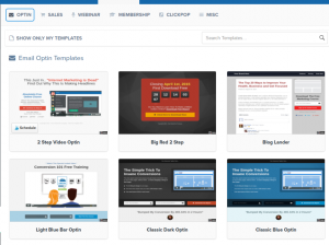
In clickfunnels, I create a new funnel, choose the type of funnel I want to create (for example, webinar, optin, membership, sales page) and then choose a template to get my optin page started. It looks like this:
I can alter that template, add my headline and relevant call to actions, like this:
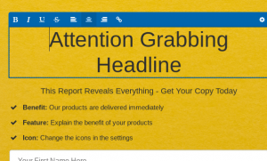
And once I’ve done that, I add a thank you page to take people to when they sign up.
Once I’ve done that, I link to my autoresponder, like so:
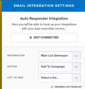
I add the freebie download on the thank you page:
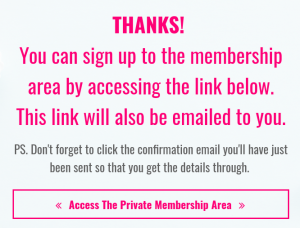
And I also link to the freebie in the welcome email that my subscribers get after opting in to my list.
And that’s it. Well, not quite, because if I’m going to make sure this works well, I need to do some testing. And this is one of the reasons I advocate investing in a proper landing page platform, as the good ones also have the ability to split test.
Split testing is basically where you take your opt-in page, make a copy, modify it, and test the two side by side to see which one performs best. Once you do that, you can start to understand that it becomes quite easy to achieve high conversion rates – you just keep testing and testing different variations of your opt-in page until you get one that converts really well. This is what I’ve done every time I’ve managed to achieve a conversion rate of over 60%.
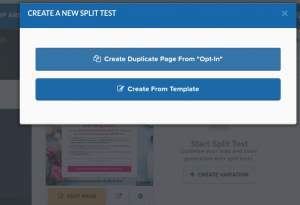
Here is how you set up split testing in Clickfunnels
Split testing is simple pressing a button to set up a test. Before testing, just make sure there is a difference between the two pages (for example, different headlines) and Clickfunnels will take care of the rest.
If you are interested in trying clickfunnels, this link will give you the opportunity to try it free for two weeks:
Get the 14 day free trial of Clickfunnels>>
There you have it. A landing page that you can use pretty much anywhere on the internet to help you grow your list. That’s going to make a huge difference to how fast your list grows, even when you are still in the early stages of getting traffic to your blog.
In the next post, I’m going to return to blogging for list building, as it is really important and there are a few blogging tricks that I want to share with you that are going to help you improve your list building rates with very little effort.

