I’ve been fortunate enough to use two of the top landing page platforms in my business – Leadpages and Clickfunnels, and I wanted to give a review of the two products side by side, because I know that a good landing page tool is one of the most critical decisions for a new entrepreneur to make when they are starting up their business.
Read on for a Clickfunnels vs. Leadpages review. I’ll take you through some of my own results, what I’ve learned along the way, and some of the downsides.
What is Leadpages?
Please note this post may contain affiliate links. Please refer to my disclosure for more information.
For anyone unfamiliar with Leadpages, I’ll explain what Leadpages is and why it’s something you might want to consider for your business. You can skip this session if you already know this.
Leadpages offers a very clear and focused service to businesses and entrepreneurs. They provide landing pages: single pages that have one objective for a business, and that’s to help them market their business. Most businesses use them in conjunction with their main website, and that’s exactly how I use them. I create opt-in pages (you can see an example here), sales pages (example here) and I also have some built-in widgets placed across my site to help me build my audience and my list (check out the call to action on the right hand side of this page advertising my 20 tools resource – when you click it, it opens up a Leadpages-powered signup window – Leadpages call this a Leadbox).
Each one of these is a single page or box I created within Leadpages. I hook them up to my email provider (Mailchimp) and voila, I have opt-ins, sales pages and signups that I use the support my marketing efforts , grow my list and increase my sales.
Why I chose Leadpages
Six months ago, I had a very small list and I wasn’t yet at the point of selling any services or products on my website. This was just a blog. My goal at the time was to create three services to sell, build up my email list, and market my business. I’m part of quite a few online networks of entrepreneurs, and Leadpages was recommended to me…a LOT. Leadpages pitch themselves as a marketing tool, and I guess that’s what I was after: a powerful marketing tool.
Their features (in a nutshell)
So here’s what Leadpages offer, and why I chose them:
Publish a landing page (without having to code)

The killer pitch which sold me this product was the ability to create a page without coding. Obviously, if you are using WordPress – which is what my website is built on – you can get away without having to do anything technical…providing you stick to a simple website. But once you start adding in more complexities like a particular sales page layout, links to sign up forms, then it can become a little bit fiddly.
I’m not completely averse to getting my hands dirty with the more technical sides of WordPress, but unless you are a pro, it can become time-consuming. And in my head, time equals money. My rule: if you are trying to get something done on your business and it isn’t your expertise, pay someone (or something) who can get it done faster than you.
There were two other lines in the Leadpages pitch which won me over. Firstly, they claim that you can create a landing page in just five minutes. As I’ve already said, to me fast is good if you really want to grow your business at a rapid rate. And secondly, their landing pages are also mobile friendly, which is a MUST in 2015 if you don’t want to say goodbye to a huge percentage of potential customers.
A library of ready-to-use landing page templates
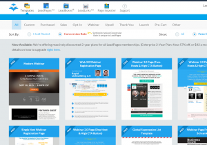
As a user of WordPress – a platform with the helpful feature of allowing a website owner to change themes at the click of the button, I’m familiar with the whole ready-to-go beauty of templates. I’m a pragmatist, and I know that it’s not realistic to spend hours or days designing the perfect website, pay someone thousands to build it, and stick with that design for one to two years. It just doesn’t happen like that when you are in the early stages of your business. As an entrepreneur, you have to be nimble. You have to spot changes in the market and you need to be able to respond to them rapidly. So being able to choose from a large library of templates and change designs almost instantaneously was a real winning point for me.
Integration with mailing platforms (seamlessly)
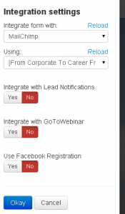
Leadpages integrates with a number of email platforms. In jargon- free language, what this means for an entrepreneur is that they just type in the details of their email platform and link it up, without having to code, and when people use a signup feature on a Leadpages page that person will go straight on to your existing email list.
Pop-ups that you can integrate with your main website (known as Leadboxes)
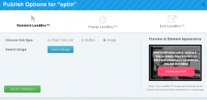
This is something I wasn’t aware of when I signed up. I actually think it’s a fairly new feature. But I’ve since tried out Leadboxes on my website. They allow you to add a graphic call-to-action to a page, and when a visitor clicks on that, it opens up a pop-up prompting them for their email address. So it’s a useful extra feature to increase your email list. I’ll talk in the results section about how well this worked for my business.
A tool called Leadlinks
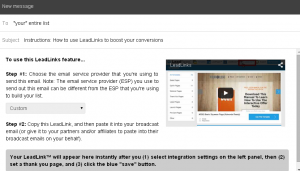
I don’t currently use this feature, though I probably will in future as my list grows and I launch further programs and offers. It allows an existing subscriber to join a new promotion you are running (for example, a competition or a webinar), without having to re-enter their email address.
My results
This is the section I really wanted to take you through, because I’ve done quite a lot of experimenting with Leadpages now and I’ve had some really interesting results which I think you’ll find valuable:
I tweaked my sales pages several times and the latest one converts at 10%
This is what I like about Leadpages. Quite often, I’ll spend time putting together a sales page, and then cringe when I look at it a few weeks later. Here’s a screenshot of an old one. I’m almost at pains to show this:
I’m always studying conversion rates on pages and I know there’s always room for improvement, so it was really helpful to my business to be able to login to Leadpages and create an entirely new page design from scratch. The latest one (which you can see here) uses a page template called Adwords/PPC 2.0 landing page (catchy title, huh?). I tweaked it with my own website color scheme and graphics, and the latest sales push I did converted at 10% on that page. It’s my low-priced product but I’m still happy with those sorts of figures. I’ve also used the same template across my other two sales pages, so there’s a nice design consistency between the three products I sell now.
My opt-in pages are converting as high as 50%
This is the biggest result for me. Previous opt-in pages I created (on Leadpages) converted at around 10-15%, which isn’t that great. With those sorts of conversions, it can make advertising really expensive (and I use paid Facebook advertising a lot to drive new traffic and opt-ins to my site, so my conversion rate is very important). However, that 10-15% did give me a starting point from which to work with. So I tried out different landing pages, headlines and images (all using Leadpages) and tested the conversion rates.

After some changes, I managed to get the opt-in up to around 50% – consistently, which is a figure I’m really happy with. That, to me, is the true value of Leadpages: being able to test and tweak rapidly to improve your results. That alone saved me a lot of money on advertising and therefore really helped increased my business profits.
The fade-in box has been really useful on a recent campaign I ran (I think it helped conversions)
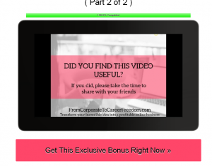
I don’t have any stats for this one because I didn’t test a like-for-like comparison, but I did want to mention the fade-in box because this is a really effective sales tool. It’s essentially a button that you place on a video page (for example, a webinar, or a pre-recorded video) that only appears at a set time into the video recording. So why is this so useful? Well, if you are using video to pitch your product to an audience, you can control how much of your video your audience listen to before they can scan a sales page. It allows you to present your pitch properly without distractions on the page, and the user is rewarded for their wait by the button appearing towards the end of the pitch. It is highly effective, and I do think this had a positive impact on my recent sales when I tested it out.
Split testing pages has fast-tracked improvements that would have taken weeks
I’ve alluded to this already but it deserves its own heading. Time is really important to me, as it is to any entrepreneur. I juggle my business with looking after a toddler, so I don’t have the luxury of working 12 hour days, 7 days a week. But I do want my business to grow fast. So I’m always looking for shortcuts, efficiencies and tricks that will allow me to speed up my progress. So Leadpages was really valuable from that point of view. If I had tweaked and tested this pages manually, it would have taken a long time to get the layout, color scheme, and structure right. Time I could be spending doing other marketing activities or working directly with my existing customers. So for me personally, there’s a lot of value in Leadpages as a time-saver.
Pros
Here’s my summary of what I think the main plus points are for Leadpages:
Easy to use
I love tools that are really easy to use, and Leadpages definitely fits into that category. The template is pretty much complete from the start, so all you need to do is tweak the colors, images, text, and you can remove any part of the content you don’t want on the page.
Leadpages has done all the hard work discovering what pages convert
This one is really interesting. When I first logged on to Leadpages, I found that I could select templates based on those that had the highest conversions. This is a great asset. Why do all the work to test out pages to see what converts and what doesn’t, if someone has already done the hard work for you?
Hughly positive impact on conversions, and therefore your profit
I won’t write too much here, because I’ve already mentioned it in the results section. But upping my conversion rate had very positive impact on my profit.
It’s quick
Lastly, Leadpages allows you to adjust, test, and tweak pages very quickly. That was a significant benefit to me. It took me about a week or two to go from 10-15% conversion to 50% conversion. Imagine how long that would have taken if I’d been creating new web pages from scratch.
Cons
I promised this was going to be an honest review, and it is. Leadpages does have its weaknesses. There are some things about the system that frustrate me, and I’ve listed them here.
Brand inconsistency
The major problem with using Leadpages in conjunction with your website is that you are never going to be able to fully replicate your website design on a Leadpages template. This is going to be a problem if you’ve spent a lot of money carefully branding and designing your website. Here’s a comparison of the branding I have on my homepage and the branding I have on my (Leadpages-powered) sales pages:
[left]

[/left]
[right]

[/right]
What I do to try and minimise inconsistency is stick to the same colors, fonts and similar imagery.
Expense
I like to keep costs low, and I think that’s especially important for a startup. So I tend to avoid services and products that have a monthly payment fee attached. And there’s no doubt that at $25 a month minimum, this sort of tool is expensive for a brand new startup. It has definitely been worth the money for me, but I would recommend businesses wait until they are at the stage where they are going to get immediate use out of it before making the purchase.
Limited flexibility with templates
This was a big downside for me. Although Leadpages has many templates, how much you can change within that template is limited. This is deliberate on the part of Leadpages. They’ve designed these templates to be optimal in terms of conversions, but what that means to you as a user is that you can’t start juggling around the layout, adding extra buttons etc. Here’s an example of some bullet points I have on one of my sales pages:
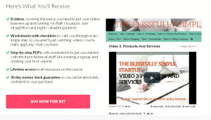
Can you see that the left and right hand columns don’t line up? That’s because I’ve got one too many bullet points. But I didn’t want to sacrifice that information. It’s a minor thing, but the perfectionist in me hates that misalignment.
Some of the design can be a little too garish
Now, prior to life as an entrepreneur, I spent many years working in web design agencies in the UK. I’ve worked on many websites that have won design awards, and always understood the importance of look and feel. So some of the Leadpages templates that are on offer do make the old me cringe. Irrespective of how well they convert, the designs can be pretty loud and garish looking.
Tips
If you do choose Leadpages, here’s some tips on how to get the most out of it.
- Have clear business goals. Understand what you want to achieve by using Leadpages and set that as your main goal – for example, adding an extra 100 people to your email list every month, or having a sales page that converts at 5%. Always return to this big goal and look at how you can take action within Leadpages to achieve it.
- Test frequently. I would run some tests at least once a week. To get decent traffic to your pages so you have proper data to test with, you will probably need to advertise (unless you have high traffic volumes to your website), but testing weekly will give your business the momentum it needs to grow rapidly.
- Leadpages offer a lot of free webinars. I’m often dialling into webinars, and I can honestly say that the Leadpages ones are some of the most informative I’ve been on. Not only will they help you make the most out of the product, but if you are on a webinar where Leadpages are pushing a promotion on you, it’s a fantastic lesson in effective selling on the internet – they are highly persuasive!
- If you really want to get bang for your buck, use it as much as possible from day 1. It’s a powerful tool, so don’t let it go to waste.
What Is Clickfunnels?
Clickfunnels is slightly different to Leadpages. Whilst it still offers the ability to create landing pages, it pitches itself more as a “sales funnel” platform (hence the funnels part of the name).
The funnels feature is the main reason why Clickfunnels has grown so fast as a business and has captured the attention of so many top marketers.
What the funnels feature does is allow you to create an end-to-end marketing platform in one place. You start with a landing page (or opt-in page, as they are also called), and once done, in Clickfunnels you can add upsell pages, sales pages and checkout pages (including payments integration). It’s very slick, and highly effective.
Why I Chose Clickfunnels
Even though I found Leadpages a valuable asset to my business, as my business became more established and my marketing became more advance, I started to experience some of the drawbacks of Leadpages – namely, the limited flexibility when it came to changing templates. What I wanted to do with my pages – particularly my sales pages, I couldn’t do in Leadpages. I needed something that would offer me more flexibility. And that’s why I switched to Clickfunnels.
Their Features (In A Nutshell)
Opt-in page creation
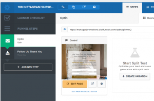
As with Leadpages, Clickfunnels offers the ability to create opt-in pages (and it takes a mere 5 minutes from start to finish). It also has a fantastic split test capability, which allows you with a couple of clicks to create an alternative page and send traffic between the two, to see which page gives you the higher conversation rate. This feature alone has been critical to some of my great results (see the results section below).
Easy integration with mailing platforms
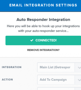
It’s a few quick clicks to add your mailing platform into Clickfunnels. What I really like is that you can add more than one mailing platform. That’s useful if you build funnels or opt-in pages for third parties (customers, for example).
Funnel templates
Clickfunnels has a whole host of tested templates that you can use to build your landing pages and sales funnels, and I’ve had great success using these templates to get high conversions (see below in the results section). In addition, they also have a marketplace where you can buy additional templates from third parties. Well worth using and could save you a lot of time in trying to reinvent the wheel.
Sales pages
The ability to create custom, highly stylish looking landing pages is one of the main reasons I switched to Clickfunnels. There are a lot of features I like. For example, countdown timers, pricing tables and great analytics to monitor your conversion rates through the sales funnel. You can also create products within Clickfunnels, price them, and promote them on a sales page, so it’s an all-one-one solution that will allow you to sell a product without needing another third party piece of software.
Payment integration
Clickfunnels has a lot of integrations, including payment integrations, but the one I like and prefer is the integration with Stripe, which is hands down (in my opinion) the best payment platform on the market right now. I can easily set up single product sales, upsells, and also recurring monthly membership payments, plus 14 day trials.
Drag and drop
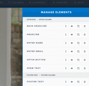
Putting together a sales page in Clickfunnels is useful for someone like me who has few technical or design skills. Most sales page designs you want to achieve can be done pretty easily using their drag and drop functionality, to add images, video, headings, countdown timers to the page, as well as creating multiple columns or tables. With a full array of button styles, icons, fonts, and colors, it’s more of a question of what you can’t do in the system.
Membership area
If you plan on running a membership site or an online course, Clickfunnels has this ability. This is a big plus to me. Most membership and training platforms are expensive, and you need to integrate them together with your sales page and payments. In Clickfunnels, you do this all in one place.
Pop-ups
As with Leadpages, you can create a pop up to add to your site for people to opt-in to your email list. Fast, and a feature that has long been proven to covert well.
WordPress plugin
If you want an opt in or sales pages on your WordPress site, Clickfunnels has a WordPress plugin that will allow you to do that in simple steps, without needing to do coding.
My Results
With the ability to split test, my first experience of using Clickfunnels gained me some fantastic results.
I created an opt-in page for my website and it converted – consistently – at 65%
That result was staggering, and I thought it was a one-off. But since then I have replicated it numerous times (I think the highest I’ve managed is 68%). It provides great reassurance as an entrepreneur when you can set up something like an opt-in page and know you are working with a system that’s going to help you get it right – quickly.
Pros
- The biggest pro for me is really the flexibility, and being able to use Clickfunnels to create all sorts of content, pages, membership areas, payments integration, opt-in. If you really wanted to, you could skip the whole process of building a website and just get your business started by building a couple of pages in Clickfunnels. You could get an entire business up and running in just a couple of days.
- They have great support and a big library of FAQs, so it’s easy to find a solution when you get stuck.
Cons
- There are lots of features, and though that may be great for some marketers, if you are just starting out and only want to create simple landing pages, Clickfunnels may not be right for you. You’re better off with a lower cost option just to get you going (if you just want a simple free option for signing people up to your website, I’d highly recommend Hellobar).
- Again, it’s pricey if you’re just starting out ($97 per month). I switched when my business got to the point where I was making good use of a lot of the features it has to offer – the sales pages, funnels, upsells, payments, but if you’re a brand new business and want to keep costs low, you might want to start with a lower cost option and switch later.
Tips
Clickfunnels have a free two week trial on offer at the moment (I’ll link to it below). I’d recommend setting side a couple of weeks to try it out and have a play around with the features, for example by building a simple opt-in page and thank you page in it, testing it, and seeing the results. That won’t cost you anything, and is a great way to see if the system is right for you.
Get your free Clickfunnels 2-week trial here>>>
Leadpages or Clickfunnels – which system is right for you?
So let’s get to the verdict of Leadpages vs Clickfunnels. If you want a simple option, Leadpages is the way to go. It is easy to use, powerful and proven to work. However, if you want to get to the point in your business where you’re starting to sell things, and you want to set up sales pages, payments and sales funnels, Clickfunnels is a far better long term option.


Oh my goodness! Incredible article dude! Thank you so much, However I am experiencing problems with your
RSS. I don’t know why I can’t join it. Is there anybody having similar RSS problems?
Anybody who knows the answer will you kindly respond?
Thanks!!
Driver Booster 4 recently posted…Driver Booster 4